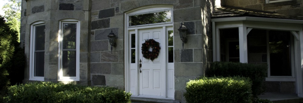
We have finally taken possession of the house. Which means that the renovation plans can now proceed in earnest. And an hour after picking up the keys to the house, we were well into discussions on what to do and how to do it.
Since our initial meeting with Gene, he had been working on some conceptual options for how we could approach the renovation. In particular, a big question was what to do with the kitchen. Kitchens play a major role in any house. They are its centre, its gathering point, and the place every party migrates to. It is important, then, for the kitchen to be a place that you want to hang out in.
This creates a particular challenge in Boo Manor. The kitchen is truly the centre of the house – it is the dividing line, in fact, between the old house and the new house. Not just a place to wind up, it is in fact a thoroughfare, and one that is quite well travelled. On one side is the formal dining room, a gorgeous wood-panelled room in the original farmhouse. On the other side is the great room, the central living room with open windows, warm hearth and welcoming light. In between these two entertainment spaces, and central to both, is the kitchen.
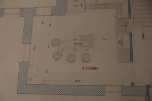
The current kitchen has a number of problems. For starters, it is dark. It is an addition to the original house, but likely a very early one, and the walls are the same 18-inch-thick masonry featured in the rest of the farmhouse. Two narrow windows are the only source of light, and two doorways carve a path from old to new. The layout of the kitchen does what it can within this space; the cupboards and counter line one corner, and an island is an anchor in the middle of the room. Around the perimeter, however, is dead space. The previous owners had a table in the far corner, and a cabinet on one wall, but the result is a dark room that productively uses only a fraction of the space that is truly available.
Faced with this challenge, Gene came up with some options. The first was simply a refresh of what was there now; the same layout, just more modern and with new appliances. The challenge is that it solves none of the current problems, it merely gives them a new veneer.
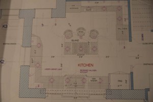
His second option, though, revisited the room from the outside in. To be functional, kitchens need a workable triangle between fridge, stove and sink. The sink is in many ways the anchor, and ideally is below a window, to give you something to look at while otherwise up to your arms in soapsuds. Given that the windows that exist are both narrow and in opposite corners of the kitchen, immediately adjacent to each doorway, they didn’t afford much in the way of an option. Gene’s solution? Let’s move the window.
And so began a design that envisioned a good 10 feet of window, lightening up the room considerably and providing a suitable anchor for the rest of the room. A counter could now line the outside wall, along with fridge, dishwasher and cupboard space. Across the room, more space for pantry, ovens, microwave and appliance storage. An island with cooktop becomes a central focal point for a completely revitalized kitchen that becomes somewhere you want to stop and spend time in, rather than something you want to pass through as quickly as possible on the way to somewhere else.
The new design solves a number of problems with an otherwise difficult room. It becomes much lighter, makes far better use of space and provides considerably more storage. And all we need to do is carve a brand new window out of a hundred-year-old wall. That seems reasonable, doesn’t it?


