Sinks, and Faucets, and Lighting, oh my…

After yesterday’s shopping blitz of granite, flooring and tile, the focus of today was on plumbing and lighting. The finishing touches to build upon the fundamentals of the previous day, as it were. For these, we ventured a little further east (or, more to the point, not quite as far west) to Kitchener, Dianne’s old stomping grounds.

The first stop was at the plumbing shop, to pick both kitchen and bathroom fixtures. After yesterday’s total oversight in picking granite for the bathroom, we weren’t going to make the same mistake twice. We would be selecting bathroom options as well. In fact, this is where we started. Although for reasons that remain baffling to me, however, I neglected to take any pictures. But rest assured that we have managed to select some awesome choices.

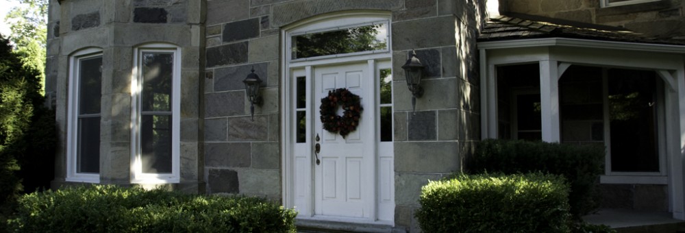
The bathroom is going to have an old world, very traditional feel to it – hence the marble tile options that we began with yesterday. On the drive out to Kitchener, Dianne and I built on this idea – the concept is a traditional bathroom vanity, of the sort that might have started out life as a sideboard or cabinet. It could be a new vanity, or could even be a refinished antique. Top with a marble undercount sink, and paint a funky rich colour (a deep, antique blue, perhaps) and call it done. Which leads to some pretty traditional taps and faucets as well. Fortunately, Grohe makes a pretty decent line of traditional-looking faucets that will work pretty awesomely in both the sink and the bathtub. Extend those throughout, and we still need to find a vanity and an appropriate slab of granite, but the essentials are in place.

As far as the kitchen goes, decisions were equally straightforward. Dianne saw and immediately fell in love with a white, porcelain fireclay farmhouse sink. Despite looking at a number of other potential sinks, ranging from stainless steel to cast iron, she was not to be swayed. Add a traditional-looking faucet, and we pretty much had a kitchen finalized. And so, plumbing dispatched in relative short order, it was on to lighting.

Lights are, no doubt, going to be a different story. We have several fixtures to buy, in some instances for rooms that we haven’t done a lot of planning and design for. We need pendant lights for the kitchen, sconces for the bathroom, a new chandelier for the dining room and also a light for what will become my den (it used to be the formal parlour of the house, and has a horrid 1970’s style bedroom flying saucer light in it currently.

We started at Urban Lights in Kitchener, a cool little store in a strip mall on the east end of Victoria avenue. Much of their selection is fairly modern and contemporary, so there was an initial question of how much we were going to find for the house. For most of the house, we are looking for more traditional pieces – or at least pieces with a traditional feel.

We started with the pendant lights for the kitchen. Urban Lights has a line of low voltage pendants that come in a wide variety of colours and shapes, from Wilmette Lighting. They take the traditional idea of a low voltage bendy track and ramp it up several notches in terms of style and flexibility. We considered a variety of shapes and styles, but didn’t quite get the right colour or the right style, until Gene discovered an awesome Victorian-style pendant in a corner (called, coincidentally enough, a Mini Victorian Pendant). These will hang either side of the range hood over the island, providing task lighting while cooking.

For the kitchen – a nice, classy Victorian pendant

For the bathroom, we wanted something simple in a sconce, that would again provide a traditional feel that would accent the marble tile and chrome taps that we had already selected. While we looked at some more ornate sconces, including some in an antique finish, and others with much busier designs. We finally selected a plain, simple sconce in a chrome-like nickel finish that match wonderfully with the options we have already picked up.

For the bathroom – a simple, clean, bright sconce

My den was more of a challenge. My design spec, in all humorousness, was ‘dangly but manly’ (take that as you will). I wanted something chandelier-like and with some substance, but that wasn’t frou-frou. Urban Lights definitely had some options, including some Restoration Hardware-ish lights that wouldn’t look out of place in the lair of a super hero who spent way too much time watching Home & Garden TV. Truth be told, however, these were a little too imposing for what I was hoping to find.

Designed to appeal to those with a taste for the industrial steampunk look…

What I did find, though, was a beautiful hanging light in a bronze finish. It has beautiful, old-looking dimpled glass and a nice clean finish that, paired with an Edison bulb, looks spectacular. And not too out of place with the plans for the rest of the den.

The ultimate choice – manly and dangly, but respectable

One store later, and we have kitchen pendants, bath sconces and a manly-but-dangly light for the den. What still remains is the chandelier for the dining room. Nothing really stood out for us today, but we were dealing with a smaller collection, we haven’t really developed a clear picture of what we want, and we have time on our side. So that will be a project for a different day.

In two days, though, we have picked the majority of the pieces that we need – granite for the kitchen, flooring and tile throughout, lighting for most of the rooms and plumbing for all of the rooms. What remains is granite for the bathroom, an appropriately funky vanity and a chandelier for the dining room. Which simply means we have to go shopping again.

We Were Floored (Tiled, Too…)

Having decided on the granite for the kitchen this morning, this afternoon it was about flooring and tiles. After a lovely lunch at the Katana Kafe (not responsible for the naming, but it is a wholly funky little restaurant right on the edge of London airport; the window looks out on the apron and both runways) we headed to Woodstock.

In our last house, we had tile in the kitchen (and therefore also the dining room, hallway and back entrance, it being all open concept). While easy to clean and durable, it is awfully hard and unforgiving (on wine glasses, as well as on feet). This time around, Dianne was proposing hardwood in the kitchen. While that might sound at first blush unusual (I know I did a double take), apparently it is more and more common to see hardwood throughout the house, including the kitchen. It is warmer, more forgiving and for the most part just as easy to maintain.

In Boo Manor, we already have a great deal of hardwood. In fact, at last count, we have at least five different shades and styles of wood, and that’s just on the main floor. The dining room alone has wood of three different colours – from red to brown – and the great room and new addition has clear maple throughout. So part of the challenge was finding yet another wood floor colour and style that would be appropriate, not clash and tie together maple at one end of the kitchen with century-old oak at the other. How hard can that be?

We found our floor just lying underfoot. Literally.

As it turned out, it wasn’t hard at all. In fact, the answer was lying under our feet the minute we walked into the flooring store. And I mean that quite literally. There was a sampling of an engineered hardwood that was absolutely perfect – wide slabs, oak and hand-scraped for a natural, old-wood feel. The boards are beautiful, showing up grain and knots, with undulations where they have been ‘shaped’. But, because they are engineered, they are virtually impermeable to scratches, moisture and damage – which is pretty much exactly what you want in a kitchen. Or in a basement, for that matter. Because we liked the wood so much, we’re using it there too. So five minutes in, we’ve selected the majority of our flooring. Like I said, keep up.

Of course, there is still tiling for the kitchen and flooring for the guest bathroom, which we are also tackling during this project. For the kitchen, we wanted something that would be traditional, clean and appropriate to an 1800s farmhouse kitchen. What we found, relatively quickly, was a really nice subway tile that had some beautiful accent tiles – a plain pencil tile, as well as a more ornate pencil tile. While originally drawn to the white version, holding the tile up to the sample of Bora Bora that we had said that the grey tiles were the way to go – the detailing on the ornate pencil tile matches the green of the Bora Bora granite perfectly, and the grey is a nice, clean accent.

Tiles for the kitchen. A simple subway tile, and a lovely accent.

From there, it was a quick move to paint colours, along with a change to cabinet colours. One of the nice things about custom cabinets is that you can order them in quite literally any colour you want. And so we are going with a light grey-green upper, and a slightly darker grey-green on the lower cabinets and on the island, that perfectly pick up the colour of the granite and the tile backsplash. This means that, a half-day in, we’ve pretty much got a kitchen design. Pretty good work, if you ask me.

Take one Bora Bora granite sample. Add Benjamin Moore swatch book. Mix liberally.

That led us to the bathroom. This led us to our first realization – which is that we never quite got around to picking a granite for the guest bathroom. We were so focussed on the kitchen that the idea of choosing stone for the bathroom slipped our collective minds. Not to be deterred, we decided to start with tiles and see where we went from there. Again, we were looking for something traditional and classic. Gene found a gorgeous hexagonal marble tile, that also had a matching subway tile and pencil and chair rail features. While we had originally considered it as an option for the kitchen, it quickly became our go-to choice for the bathroom.

Tile for the guest bathroom. Traditional hexagon floor, and awesome wainscotting options!

The design should be beautifully classic. The hexagonal tile will be the floor. We are also going to do tile wainscotting up the wall – the pencil tile will be at counter height, with subway tile below that. Above the pencil tile will be one more row of subway tile for a backsplash, topped by the chair rail. Beautifully traditional and European; inspired by some of the bathrooms that Dianne and I have adored while staying in Paris. Now we need to find a nice, clean piece of marble or granite to go with it – which will mean another visit to Alberto once he finds us our Bora Bora.

All in all, a good day. We found our granite for the kitchen, chose our flooring for most of the renovation, and found tile for the kitchen and bathroom. We returned to Boo Manor to check out our samples up close and in person, and by five-o-clock were dropping Gene off at his house. And joining him and Jenni for a welcome glass of wine or two to celebrate a day of decisiveness – while anticipating our choices for the next day.

When The Going Gets Tough, The Tough Go Shopping…

And so, it’s that time. The time to pick out what we want in terms of finishings for Boo Manor. Granite, flooring, plumbing, lighting… the works. This is where major dithering and debate can happen, not to mention untold arguments, disagreements, exhibitions of righteous indignation and walking-off-in-a-huff displays of orneriness. This is where a designer earns their keep, delicately negotiating between husband and wife, while trying to ward them off of decisions bordering on, in aesthetic terms, capital offences. Unless, of course, they are working with us. Then they just need to keep up.

The first order of business was finding granite. In that there are much fewer options for granite, and infinitely more in terms of tile, paint and colouring, the theory is that we start with an anchor and work up from there. So we picked up Gene and headed off to London to find some stone.

The granite showroom. How we are used to shopping for granite.

What we found at our destination was a showroom that looked a whole lot like the showroom that we picked our last granite from. There is a wall of samples, of a reasonable size, that show the types of stone available and the finishing options that can be applied. We hung around for a while, waiting for the granite consultant, considering our options. This, though, is not how Alberto helps you to pick granite. No wimpy samples for him. We’re going back into the warehouse to look at whole slabs.

Shopping for granite, Alberto style. Samples? Bah. We’re going to look at slabs.

Granite, when quarried, starts life as a 50,000 lb. block of stone. And no, I am not making that figure up. It’s a block that is about six-by-six-by-nine feet in size. From there, it is cut into a slab that is, depending upon the quality of the stone, either 3/4″ or 1 1/4″ in thickness, but still a good six feet by nine feet in size. And not light. To check out one stone, Alberto had one of the workers turn it around. This involved a ceiling mounted crane that can literally go anywhere in the warehouse, pluck up a stone in hydraulic pincers, and carry it wherever it needs to go.

Moving a slab of granite. Making it look this easy involves some impressive machinery.

When you look at a slab, you realize just how much variation there is in stone. Two slabs mere feet apart in the original block can show completely different colouring and pattern. Given that a kitchen the size of ours will use at least two (and probably three) slabs, you need to work with consecutive panels from the same block. And you get to pick your slabs. The actual one that will go into your kitchen. Or bathroom. Or wherever.

The CNC machine makes cutting giant pieces of stone look like child’s play.

Working with Alberto was hilarious. For the most part, he doesn’t think about price. Differences between grades one and five are rounding errors, and from there we progressively move from eek to boing. In his perfect world, every kitchen would be finished with Carrera marble. In fact, he showed us slabs that came from the same marble quarry that supplied stone for sculptures by Michelangelo. Impressive as that is, marble is really not optimal for a kitchen; it is porous, shows scratches and changes colour with time. For Alberto, this is ‘developing a beautiful patina’; and in a bathroom, I might go for it. But I cook with cast iron frying pans, and I’m not about to change, so granite it will be.

Having toured the warehouse in its entirety, we quickly settled on a short list of two slabs. As I said, keep up; we move fast. One was an amazing piece of granite that featured gorgeous, warm colouring – browns, beiges and blacks in a really intriguing, vibrant pattern. Very tempting, and for a while it was my first choice (although I think it never got higher than number two on Dianne’s short list). It would have made a major statement in the kitchen, and pretty much defined the look and feel of the rest of the room. Counters as show pieces. Two years ago, I would probably have gone there, as well. Today, we’re buying for us, not for what other people think of us.

A beautiful piece of stone. Vibrant and impressive.

And that led to what quickly became a unanimous choice – a mellow, green and brown granite slab dominated by gorgeous undulations of grey, black and brown; it almost looks sedimentary, but isn’t. That also led us to revisit our choices in terms of cabinet colour (we were going with an ivory cream colour, but have since recanted – we may be decisive, but we’ll still change our minds when necessary). Called ‘sea mist’ or ‘Bora Bora’, depending upon who you ask, it is a fabulous, relaxing, awesome-looking piece of stone. The two slabs in the warehouse, however, are already spoken for. Which will simply not do. Alberto needs to find us three slabs of Bora Bora, stat.

Bora Bora. Or Sea Mist. Your call. Alberto, we need three slabs.

Of Windows And Walls…

Of all the rooms in Boo Manor (and there are many) the most questionable one was the kitchen. Kitchens are the heart and soul of a house. It is where every party winds up. Some parties start there and never leave. In Boo Manor, the kitchen is the main thoroughfare between old and new, and between living room and dining room. And, sadly, it was rather dark and not terribly functional.

As has already been noted, the kitchen was last done sometime in the mid-to-late-eighties, a time when bangs, baggy sweatshirts, pencil jeans and questionable headwear were all to popular. Think Boy George, or the Thompson Twins, or Platinum Blonde, or just about any other musical act with too much hair and too little fashion sense. I think that this gives us all a pretty good sense of where this is going now, doesn’t it?

And so, the kitchen needed to go. As we’ve already discussed, though, the previous layout really didn’t work very well. It worked as well as it could given the space, mind you, but it was still less than optimal. So a merely upgraded version of the same layout meant this would have been just another kitchen renovation to be damned at a future date as someone else’s (ours, this time) fashion crime. Which would not do at all. There was nothing left for it but to change the layout. Changing the layout, however, requires a new window in the kitchen.

Putting windows in a house is not for the faint of heart at any time. This involves major structural changes; you are putting a hole in an exterior wall, where no hole existed before. Depending upon what your house is made of in the first place, this is going to be harder or easier. In our case, we are dealing with a wall that was built more than a hundred years ago, and is about 18 inches thick. So in other words, no small undertaking.

There was a reason that very old houses had very small windows, of course. And that is mostly that rock is heavy. So a wide window with really big, heavy stones above it isn’t going to work so well. Narrow is better. Not particularly expansive and certainly not letting a lot of light in, mind you, but for structural soundness a narrow window is definitely the way to go.

A narrow window is not part of the design, however. We are looking at a window that, when done, will be about nine feet wide and five feet tall. This is a window of significance. A window to be reckoned with. It will not be a wimpy window. Except it is still a window in an 18-inch-thick stone wall. This is going to require some serious engineering to make work.

Cue the stone masons. Who apparently are all too happy to take one narrow window, move it three feet to the left and add about seven feet to its length. First, though, we needed structural support. Given the width of the walls, this meant adding not one but two beams, each made of three two-by-eights laminated together; one supported the roof, while the other supported the ceiling beams. Both needed to be long enough to span the old window and the new, structurally tying into the walls that are already in place.

With beams in place, the masons could begin excavating a hole. Mostly this involves attacking the mortar between the rocks, one rock at a time, until you have attained a hole of appropriate size. This would have been easier, apparently, if the house hadn’t already been well insulated with spray foam polyurethane. Apparently that stuff is strong. Stronger, in fact, than the mortar. And therefore infinitely more frustrating to try to break apart and tear down.

It’s a hole. A very big hole. (Photo Credit: Gene Martin Design)

Eventually, though, we had a hole. And it was big. Very, very big, in fact. From there it was a matter of filling in the old window and finishing off the boundaries of the new window. To do this, the framers built a wooden ‘buck’ (a fake window made of plywood and two-by-fours that replicates the exact dimensions of the new window) and the stone masons filled in the blanks. A piece of Indiana limestone provided a new sill, and non-polyurethane-covered stones were reclaimed to finish off the wall edges.

One big hole, and one giant pile of rubble. (Photo Credit: Gene Martin Design)

Sadly, we weren’t able to get out to the house while the window was being built, because it would have been pretty awesome to watch. The end result, however, is also pretty spectacular. We have a new window where one did not exist before. And we have no window where the old one had been.

Taking the old rocks and making them fit, the old fashioned way. (Photo Credit: Gene Martin Design)

The weather was favourable enough throughout the process to allow the mortar to cure, without having to resort to tarpaulins and heaters. The result is a hole for a window that a nineteenth-century stone mason would have thought impractical, and probably bordering on the delusional. For the masons working on Boo Manor, though, it was just another day at the office. And for us, it’s the basis of a pretty awesome kitchen.

At the end, there was a window. Or at least, there was a hole for a window. (Photo Credit: Gene Martin Design)

And So It Begins…

It would be easy to assume that nothing has been happening for the last little while. And nothing could be further from the truth. It’s just that most of it involves lots of follow-ups and discussions and preparing quotations and figuring out just what this little renovation is going to cost us. That was a lot of Gene working behind the scenes, developing specifications, producing drawings, conducting site visits and getting quotes, until he could put a number in front of us. And what a number it was.

But we are now beginning. The paperwork is signed and we are officially underway. We did a detailed walkthrough with Gene and Seren of the plans, the quotation and what that would mean in terms of work. Neither Dianne nor I passed out, which we are certainly taking as progress. We also did a detailed walkthrough of the house itself, to go over clarifications and be able to get a real sense of what would go where, when that would happen and the questions that would need answering. We have already made changes as well. Which took all of about an hour to start identifying. Add a new toilet, change the approach to heating water… it is mind bogglingly amazing how easy it is to add things on. And it is amazing how much discipline is required to keep a project on budget. Based upon our track record to date, our amount of discipline would appear to be highly questionable indeed.

Some of the changes are quite reasonable, on the face of it. Rather than a new and larger hot water heater, we are taking the plunge (as it were) and going with a tankless, on-demand system. We had done some research earlier that raised a few cautions about proceeding with an on-demand system rather than a traditional hot water heater. In particular, early systems (and by early, we are talking only a few years ago) could run alternatingly hot and cold, and took some time to deliver heated water. Depending upon the draw, a trickle of water might meant that the hot water doesn’t engage. And when the final verdict of Consumer Reports is that many homeowners are better off with a newer model, high-efficiency traditional water heater, it’s enough to make you think twice.

Certainly there are pros and cons to both: the tankless system is a more expensive up-front cost, but saves on fuel costs over time. The hot water heater means you have hot water right there when you want it, but uses a great deal more energy and has a finite amount of hot water; a couple of showers later, you are waiting for more hot water. But the prices on tankless, on-demand solutions have come down, the reliability is going up, and given that we will be back and forth to the house, we won’t be paying to keep a really big tank of water really hot around the clock. So while we had originally veered in the direction of going with a traditional hot water heater, we are now going the on-demand route. We shall see how that plays out going forward.

In the next couple of weeks, we will be getting to do some of the fun and exciting things about renovating: choosing stone, flooring, paint colours and lights. For now, we get to face the fun and exciting challenge of paying for it all.