Of Bathrooms And Vanity

How hard can it be to buy a bathroom vanity? Really? I mean, they make enough of them. Surely we should be able to find one that works for us for the guest bathroom. After all, it’s not even a bathroom we’ll use on a regular basis.

On our previous plumbing expedition, we found pretty much everything we needed for the house — sinks, showers, faucets and spouts — in one simple trip. Except a vanity. We saw one that we thought would work, but the colour sample had gone missing. And we saw several more that would definitively not work given our mental picture of what we wanted the bathroom to look like. We were looking for an old-world, funky bathroom feel, similar to what we had seen in bathrooms of hotel rooms in Paris. Marble, old fashioned knobs and beautiful vanities (often repurposed from other pieces of furniture), combined to form beautiful, functional and unique bathroom spaces.

A modern bathroom vanity. That looks a whole lot like a dining room sideboard.

Sadly, a lot of the vanities we saw looked like sideboards. They were wooden cabinets, with wooden finishes, that looked more appropriate in dining rooms if they didn’t come equipped with sinks. We wanted something a little more unique, a little more colourful and a little more off-the-beaten path. We had enough budget to work with on this particular piece that it could be new construction, but it needed to meet the design spec (as loose as that was) of what we were looking for. So we designed the bathroom around what we wanted, choosing flooring, wainscotting, shower, toilet and fixtures, recognizing that we still needed a vanity to bring it all together.

One very real consideration was actually finding an antique sideboard, refinishing it, re-surfacing it with a stone top and a sink, and calling it done. With this in mind, we began to stop at pretty much every antique store we came across (and in our neck of the woods, there are an awful lot of them) to look for possible vanity candidates.

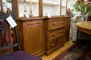
A dining room sideboard. That could be pressed into use as a bathroom vanity.

One of the first stops, within Toronto, was Of Things Past, a consignment furniture store. We were referred to it by a relative, and had previously found some great lamps for our condo when we first moved to the city. At the time, we had also noticed some amazing furniture pieces that would have been awesome for our future (as yet unpurchased) home, and had resolved to come back when we actually had a home to furnish. The challenge with any store like this is that the stock changes over regularly; you have to keep checking in to see what is there. The result is some of the pieces that we adored last time were gone, and what we were looking for wasn’t really there. One piece that might have worked as a sideboard was actually a full-on china cabinet, with an upper storage cabinet as well; putting it into service would have meant throwing away the top piece in order to get the bottom cabinet. The overall piece was too long for the space we needed, however; we would have to keep looking.

A few days later saw us travelling from Guelph to the house in order to do some measuring. Out of curiosity, I set the GPS to avoid highways in order to see what kind of route it would recommend that didn’t involve the 401. While this initially took us through the heart of Cambridge, after that it guided us to some lovely country roads that led directly to where Drumbo Road (another name for our street) begins. It also took us past Southworks in Cambridge, a unique mall that includes a massive antique market and another consignment furniture store. Trolling through the antique market, we found a great deal of interesting stuff, but no candidate sideboards. The consignment store, however, was another matter.

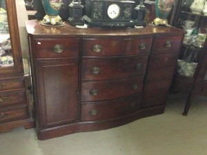
Now we’re talking. A little too long, sadly, but otherwise awesome.

Next Time Around, like Of Things Past, takes furniture and resells it – meaning that there stock turns over quite quickly. A browse through their offerings found many more gorgeous pieces of furniture, but only one possible candidate for a bathroom vanity. As candidates go, however, there was a lot that was promising. It was a beautiful and sturdy piece that had a good deal of storage, even given that the centre drawers would have to be replaced with plumbing fixtures. And the multi-level top surface was not only unique, but also offered more surface area for guests to put toiletries that would not be imperilled by sinks. Sadly, the cabinet proved to be too long – continuing our trip and completing our measurements revealed that it was a good 8 inches longer than we would ideally like. The search would have to continue.

We finally wound up at an antique market near Dundas, almost entirely by accident. We had been driving around with a sample cabinet board in the trunk for weeks, and had finally decided to return it. From there, we were going to Dundas to do some Christmas shopping. On our way to Dundas we drove past a giant antique shop. One u-turn later, and we were in their driveway to check out their wares. These included a life-sized Elvis (white-suit-era), a Fender electric guitar, several beds, some disturbingly tacky Italianate cabinetry and one very real candidate for a vanity.

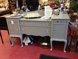
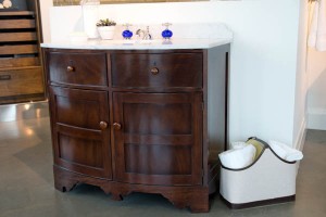
And then we found this. Perfect size, bump-out for a sink, and the price is right.

Sizing the cabinet up and down (and measuring it just to be sure) we decided it was a very real candidate. Given that the store was having a sale, and was also open to negotiation, we decided to pursue the matter further. $400 later, the cabinet was being loaded into the back of the SUV as we continued on with our Christmas shopping. We now have a vanity. It will need some work and refinishing, and we still need to find a linen tower that will complement it, but it’s a very good start. Take out a couple of drawers, add a marble-looking stone counter top and a vessel sink, and we have the basis of a bathroom. Even better, we might actually wind up under budget on this particular item. Which would be a good thing, because we seem to be over budget on a few other choices that we’ve made so far. Some balance would be very good.
Whining About Wine

Boo Manor will have a wine room. This is pretty much a given with any of our houses, of course. In our last house in Edmonton, we went through two different rooms before we were done. We started with a smaller room, built into the north-west corner, that was only controlled by being built into a concrete corner of an underground room in a city in a cold climate. In other words, the temperature varied considerably, which wine doesn’t necessarily like. And our collection grew enough that we eventually started shoving cases in, shutting the door, and pretending that we were organized.

This led us to turning our storage room into our wine room, our wine room into our storage room, and using the storage room as the exhaust point for an actual climate control system. In doing so, we learned a lot about the dynamics of controlling temperature in wine rooms, and how climate control systems work (and don’t work). This subsequently led to us excavating a six-inch duct in our newly poured foundation, and hooking up an exhaust system from the climate control unit to the outside (as all we had done prior to that was turn the ‘storage’ room into a sauna, while cooling the wines not at all).

Building Boo Manor, therefore, we are determined to do it right. This involves finding an appropriate control system to incorporate into a basement that won’t support our previous system, and finding shelving that will work for our new collection. Prior to this, we’ve used Gorm shelving from Ikea, which used to come with shelves that were specifically designed to hold wine bottles. Our previous cellar, which held close to 1,000 bottles, cost all of $400 for the shelving. Now, you need to buy normal Gorm shelves at $5 a pop, and then spend an additional $3.50 on a metal rack that goes on top of the shelf. While this will still get you there from here, it’s starting to drive the costs up considerably.

At the same time, custom-built wine cellars generally scale into the thousands-of-dollars, and I have no interest in going there. I am far less fussed about what my wine cellar looks like than the wine going in it, and if I’m going to spend a few thousand dollars then it’s going to be on wine, not on the shelving. This means that it is necessary to look at some different options, and cost out what makes sense.

I had already selected a vendor for the cooling unit, Rosehill Wine Cellars of Toronto. They had provided the previous cooling unit when we were in Edmonton, and now that we are in Ontario they even count as a local vendor. They also stock any number of other bits of paraphernalia for the wine connoisseur, from wine glasses and decanters (definitely overpriced) to shelving (which ranges from the spectacularly expensive to the surprisingly-not-bad). While talking to them about our plans for a new cooling unit for Boo Manor’s cellar, Dianne noticed that their display racking was configured to hold 700+ bottles in what still constituted a reasonably priced arrangement. And so we think we have found a solution.

The great thing about the shelving in question in that it is infinitely configurable. It is designed to hold normal bottles, small bottles and slightly-larger-than-normal burgundy and champagne bottles (which otherwise defiantly refuse to be stored in any reasonable quantity). Even better, it more efficiently uses space than the Ikea shelving that we have used in the past, meaning that we can get the numbers of bottles we have previously stored into a much smaller space, and (given that our cellar is larger) ultimately have the capacity for a much, much larger number of bottles down the road (which is also no bad thing).

What remains now is to measure and plot, and to figure out a configuration that will work for now and provide expansion possibilities into the future. This also means that Ikea has lost one of its last footholds into our house. After the wine shelving, there is only Billy bookshelves left. And they had better not stop making those. If they do, there will be hell to pay.

Sinks, and Faucets, and Lighting, oh my…

After yesterday’s shopping blitz of granite, flooring and tile, the focus of today was on plumbing and lighting. The finishing touches to build upon the fundamentals of the previous day, as it were. For these, we ventured a little further east (or, more to the point, not quite as far west) to Kitchener, Dianne’s old stomping grounds.

The first stop was at the plumbing shop, to pick both kitchen and bathroom fixtures. After yesterday’s total oversight in picking granite for the bathroom, we weren’t going to make the same mistake twice. We would be selecting bathroom options as well. In fact, this is where we started. Although for reasons that remain baffling to me, however, I neglected to take any pictures. But rest assured that we have managed to select some awesome choices.

The bathroom is going to have an old world, very traditional feel to it – hence the marble tile options that we began with yesterday. On the drive out to Kitchener, Dianne and I built on this idea – the concept is a traditional bathroom vanity, of the sort that might have started out life as a sideboard or cabinet. It could be a new vanity, or could even be a refinished antique. Top with a marble undercount sink, and paint a funky rich colour (a deep, antique blue, perhaps) and call it done. Which leads to some pretty traditional taps and faucets as well. Fortunately, Grohe makes a pretty decent line of traditional-looking faucets that will work pretty awesomely in both the sink and the bathtub. Extend those throughout, and we still need to find a vanity and an appropriate slab of granite, but the essentials are in place.

As far as the kitchen goes, decisions were equally straightforward. Dianne saw and immediately fell in love with a white, porcelain fireclay farmhouse sink. Despite looking at a number of other potential sinks, ranging from stainless steel to cast iron, she was not to be swayed. Add a traditional-looking faucet, and we pretty much had a kitchen finalized. And so, plumbing dispatched in relative short order, it was on to lighting.

Lights are, no doubt, going to be a different story. We have several fixtures to buy, in some instances for rooms that we haven’t done a lot of planning and design for. We need pendant lights for the kitchen, sconces for the bathroom, a new chandelier for the dining room and also a light for what will become my den (it used to be the formal parlour of the house, and has a horrid 1970’s style bedroom flying saucer light in it currently.

We started at Urban Lights in Kitchener, a cool little store in a strip mall on the east end of Victoria avenue. Much of their selection is fairly modern and contemporary, so there was an initial question of how much we were going to find for the house. For most of the house, we are looking for more traditional pieces – or at least pieces with a traditional feel.

We started with the pendant lights for the kitchen. Urban Lights has a line of low voltage pendants that come in a wide variety of colours and shapes, from Wilmette Lighting. They take the traditional idea of a low voltage bendy track and ramp it up several notches in terms of style and flexibility. We considered a variety of shapes and styles, but didn’t quite get the right colour or the right style, until Gene discovered an awesome Victorian-style pendant in a corner (called, coincidentally enough, a Mini Victorian Pendant). These will hang either side of the range hood over the island, providing task lighting while cooking.

For the kitchen – a nice, classy Victorian pendant

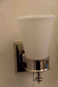
For the bathroom, we wanted something simple in a sconce, that would again provide a traditional feel that would accent the marble tile and chrome taps that we had already selected. While we looked at some more ornate sconces, including some in an antique finish, and others with much busier designs. We finally selected a plain, simple sconce in a chrome-like nickel finish that match wonderfully with the options we have already picked up.

For the bathroom – a simple, clean, bright sconce

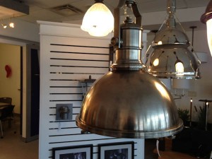
My den was more of a challenge. My design spec, in all humorousness, was ‘dangly but manly’ (take that as you will). I wanted something chandelier-like and with some substance, but that wasn’t frou-frou. Urban Lights definitely had some options, including some Restoration Hardware-ish lights that wouldn’t look out of place in the lair of a super hero who spent way too much time watching Home & Garden TV. Truth be told, however, these were a little too imposing for what I was hoping to find.

Designed to appeal to those with a taste for the industrial steampunk look…

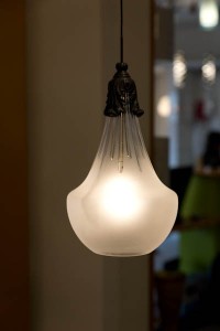
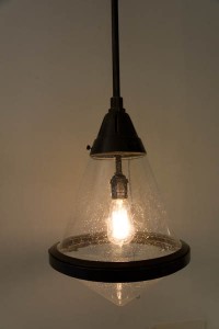
What I did find, though, was a beautiful hanging light in a bronze finish. It has beautiful, old-looking dimpled glass and a nice clean finish that, paired with an Edison bulb, looks spectacular. And not too out of place with the plans for the rest of the den.

The ultimate choice – manly and dangly, but respectable

One store later, and we have kitchen pendants, bath sconces and a manly-but-dangly light for the den. What still remains is the chandelier for the dining room. Nothing really stood out for us today, but we were dealing with a smaller collection, we haven’t really developed a clear picture of what we want, and we have time on our side. So that will be a project for a different day.

In two days, though, we have picked the majority of the pieces that we need – granite for the kitchen, flooring and tile throughout, lighting for most of the rooms and plumbing for all of the rooms. What remains is granite for the bathroom, an appropriately funky vanity and a chandelier for the dining room. Which simply means we have to go shopping again.

We Were Floored (Tiled, Too…)

Having decided on the granite for the kitchen this morning, this afternoon it was about flooring and tiles. After a lovely lunch at the Katana Kafe (not responsible for the naming, but it is a wholly funky little restaurant right on the edge of London airport; the window looks out on the apron and both runways) we headed to Woodstock.

In our last house, we had tile in the kitchen (and therefore also the dining room, hallway and back entrance, it being all open concept). While easy to clean and durable, it is awfully hard and unforgiving (on wine glasses, as well as on feet). This time around, Dianne was proposing hardwood in the kitchen. While that might sound at first blush unusual (I know I did a double take), apparently it is more and more common to see hardwood throughout the house, including the kitchen. It is warmer, more forgiving and for the most part just as easy to maintain.

In Boo Manor, we already have a great deal of hardwood. In fact, at last count, we have at least five different shades and styles of wood, and that’s just on the main floor. The dining room alone has wood of three different colours – from red to brown – and the great room and new addition has clear maple throughout. So part of the challenge was finding yet another wood floor colour and style that would be appropriate, not clash and tie together maple at one end of the kitchen with century-old oak at the other. How hard can that be?

We found our floor just lying underfoot. Literally.

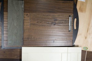
As it turned out, it wasn’t hard at all. In fact, the answer was lying under our feet the minute we walked into the flooring store. And I mean that quite literally. There was a sampling of an engineered hardwood that was absolutely perfect – wide slabs, oak and hand-scraped for a natural, old-wood feel. The boards are beautiful, showing up grain and knots, with undulations where they have been ‘shaped’. But, because they are engineered, they are virtually impermeable to scratches, moisture and damage – which is pretty much exactly what you want in a kitchen. Or in a basement, for that matter. Because we liked the wood so much, we’re using it there too. So five minutes in, we’ve selected the majority of our flooring. Like I said, keep up.

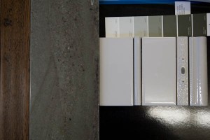
Of course, there is still tiling for the kitchen and flooring for the guest bathroom, which we are also tackling during this project. For the kitchen, we wanted something that would be traditional, clean and appropriate to an 1800s farmhouse kitchen. What we found, relatively quickly, was a really nice subway tile that had some beautiful accent tiles – a plain pencil tile, as well as a more ornate pencil tile. While originally drawn to the white version, holding the tile up to the sample of Bora Bora that we had said that the grey tiles were the way to go – the detailing on the ornate pencil tile matches the green of the Bora Bora granite perfectly, and the grey is a nice, clean accent.

Tiles for the kitchen. A simple subway tile, and a lovely accent.

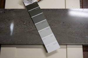
From there, it was a quick move to paint colours, along with a change to cabinet colours. One of the nice things about custom cabinets is that you can order them in quite literally any colour you want. And so we are going with a light grey-green upper, and a slightly darker grey-green on the lower cabinets and on the island, that perfectly pick up the colour of the granite and the tile backsplash. This means that, a half-day in, we’ve pretty much got a kitchen design. Pretty good work, if you ask me.

Take one Bora Bora granite sample. Add Benjamin Moore swatch book. Mix liberally.

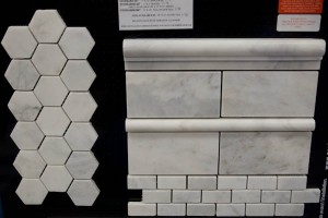
That led us to the bathroom. This led us to our first realization – which is that we never quite got around to picking a granite for the guest bathroom. We were so focussed on the kitchen that the idea of choosing stone for the bathroom slipped our collective minds. Not to be deterred, we decided to start with tiles and see where we went from there. Again, we were looking for something traditional and classic. Gene found a gorgeous hexagonal marble tile, that also had a matching subway tile and pencil and chair rail features. While we had originally considered it as an option for the kitchen, it quickly became our go-to choice for the bathroom.

Tile for the guest bathroom. Traditional hexagon floor, and awesome wainscotting options!

The design should be beautifully classic. The hexagonal tile will be the floor. We are also going to do tile wainscotting up the wall – the pencil tile will be at counter height, with subway tile below that. Above the pencil tile will be one more row of subway tile for a backsplash, topped by the chair rail. Beautifully traditional and European; inspired by some of the bathrooms that Dianne and I have adored while staying in Paris. Now we need to find a nice, clean piece of marble or granite to go with it – which will mean another visit to Alberto once he finds us our Bora Bora.

All in all, a good day. We found our granite for the kitchen, chose our flooring for most of the renovation, and found tile for the kitchen and bathroom. We returned to Boo Manor to check out our samples up close and in person, and by five-o-clock were dropping Gene off at his house. And joining him and Jenni for a welcome glass of wine or two to celebrate a day of decisiveness – while anticipating our choices for the next day.

When The Going Gets Tough, The Tough Go Shopping…

And so, it’s that time. The time to pick out what we want in terms of finishings for Boo Manor. Granite, flooring, plumbing, lighting… the works. This is where major dithering and debate can happen, not to mention untold arguments, disagreements, exhibitions of righteous indignation and walking-off-in-a-huff displays of orneriness. This is where a designer earns their keep, delicately negotiating between husband and wife, while trying to ward them off of decisions bordering on, in aesthetic terms, capital offences. Unless, of course, they are working with us. Then they just need to keep up.

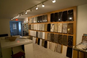
The first order of business was finding granite. In that there are much fewer options for granite, and infinitely more in terms of tile, paint and colouring, the theory is that we start with an anchor and work up from there. So we picked up Gene and headed off to London to find some stone.

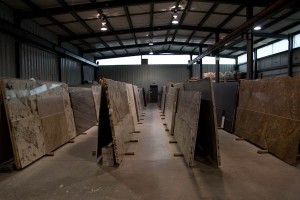
The granite showroom. How we are used to shopping for granite.

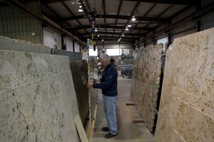
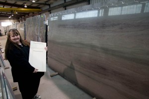
What we found at our destination was a showroom that looked a whole lot like the showroom that we picked our last granite from. There is a wall of samples, of a reasonable size, that show the types of stone available and the finishing options that can be applied. We hung around for a while, waiting for the granite consultant, considering our options. This, though, is not how Alberto helps you to pick granite. No wimpy samples for him. We’re going back into the warehouse to look at whole slabs.

Shopping for granite, Alberto style. Samples? Bah. We’re going to look at slabs.

Granite, when quarried, starts life as a 50,000 lb. block of stone. And no, I am not making that figure up. It’s a block that is about six-by-six-by-nine feet in size. From there, it is cut into a slab that is, depending upon the quality of the stone, either 3/4″ or 1 1/4″ in thickness, but still a good six feet by nine feet in size. And not light. To check out one stone, Alberto had one of the workers turn it around. This involved a ceiling mounted crane that can literally go anywhere in the warehouse, pluck up a stone in hydraulic pincers, and carry it wherever it needs to go.

Moving a slab of granite. Making it look this easy involves some impressive machinery.

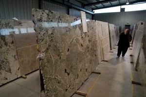
When you look at a slab, you realize just how much variation there is in stone. Two slabs mere feet apart in the original block can show completely different colouring and pattern. Given that a kitchen the size of ours will use at least two (and probably three) slabs, you need to work with consecutive panels from the same block. And you get to pick your slabs. The actual one that will go into your kitchen. Or bathroom. Or wherever.

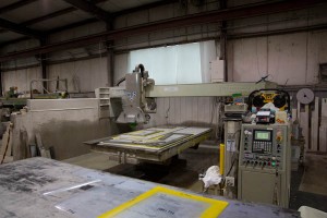
The CNC machine makes cutting giant pieces of stone look like child’s play.

Working with Alberto was hilarious. For the most part, he doesn’t think about price. Differences between grades one and five are rounding errors, and from there we progressively move from eek to boing. In his perfect world, every kitchen would be finished with Carrera marble. In fact, he showed us slabs that came from the same marble quarry that supplied stone for sculptures by Michelangelo. Impressive as that is, marble is really not optimal for a kitchen; it is porous, shows scratches and changes colour with time. For Alberto, this is ‘developing a beautiful patina’; and in a bathroom, I might go for it. But I cook with cast iron frying pans, and I’m not about to change, so granite it will be.

Having toured the warehouse in its entirety, we quickly settled on a short list of two slabs. As I said, keep up; we move fast. One was an amazing piece of granite that featured gorgeous, warm colouring – browns, beiges and blacks in a really intriguing, vibrant pattern. Very tempting, and for a while it was my first choice (although I think it never got higher than number two on Dianne’s short list). It would have made a major statement in the kitchen, and pretty much defined the look and feel of the rest of the room. Counters as show pieces. Two years ago, I would probably have gone there, as well. Today, we’re buying for us, not for what other people think of us.

A beautiful piece of stone. Vibrant and impressive.

And that led to what quickly became a unanimous choice – a mellow, green and brown granite slab dominated by gorgeous undulations of grey, black and brown; it almost looks sedimentary, but isn’t. That also led us to revisit our choices in terms of cabinet colour (we were going with an ivory cream colour, but have since recanted – we may be decisive, but we’ll still change our minds when necessary). Called ‘sea mist’ or ‘Bora Bora’, depending upon who you ask, it is a fabulous, relaxing, awesome-looking piece of stone. The two slabs in the warehouse, however, are already spoken for. Which will simply not do. Alberto needs to find us three slabs of Bora Bora, stat.

Bora Bora. Or Sea Mist. Your call. Alberto, we need three slabs.

And So It Begins…

It would be easy to assume that nothing has been happening for the last little while. And nothing could be further from the truth. It’s just that most of it involves lots of follow-ups and discussions and preparing quotations and figuring out just what this little renovation is going to cost us. That was a lot of Gene working behind the scenes, developing specifications, producing drawings, conducting site visits and getting quotes, until he could put a number in front of us. And what a number it was.

But we are now beginning. The paperwork is signed and we are officially underway. We did a detailed walkthrough with Gene and Seren of the plans, the quotation and what that would mean in terms of work. Neither Dianne nor I passed out, which we are certainly taking as progress. We also did a detailed walkthrough of the house itself, to go over clarifications and be able to get a real sense of what would go where, when that would happen and the questions that would need answering. We have already made changes as well. Which took all of about an hour to start identifying. Add a new toilet, change the approach to heating water… it is mind bogglingly amazing how easy it is to add things on. And it is amazing how much discipline is required to keep a project on budget. Based upon our track record to date, our amount of discipline would appear to be highly questionable indeed.

Some of the changes are quite reasonable, on the face of it. Rather than a new and larger hot water heater, we are taking the plunge (as it were) and going with a tankless, on-demand system. We had done some research earlier that raised a few cautions about proceeding with an on-demand system rather than a traditional hot water heater. In particular, early systems (and by early, we are talking only a few years ago) could run alternatingly hot and cold, and took some time to deliver heated water. Depending upon the draw, a trickle of water might meant that the hot water doesn’t engage. And when the final verdict of Consumer Reports is that many homeowners are better off with a newer model, high-efficiency traditional water heater, it’s enough to make you think twice.

Certainly there are pros and cons to both: the tankless system is a more expensive up-front cost, but saves on fuel costs over time. The hot water heater means you have hot water right there when you want it, but uses a great deal more energy and has a finite amount of hot water; a couple of showers later, you are waiting for more hot water. But the prices on tankless, on-demand solutions have come down, the reliability is going up, and given that we will be back and forth to the house, we won’t be paying to keep a really big tank of water really hot around the clock. So while we had originally veered in the direction of going with a traditional hot water heater, we are now going the on-demand route. We shall see how that plays out going forward.

In the next couple of weeks, we will be getting to do some of the fun and exciting things about renovating: choosing stone, flooring, paint colours and lights. For now, we get to face the fun and exciting challenge of paying for it all.

Of Renovations New And Old

This is not the first time that the kitchen of Boo Manor has been renovated. It is not even, in fact, the first time that the kitchen of Boo Manor has been renovated by Gene, our designer/contractor/awesome-wood-working guy. The current kitchen was actually his first project on the house. It was also not his last.

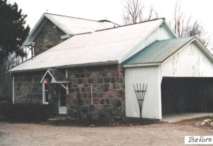
Boo Manor, pre-addition. Or renovation. Or any attempt at beautification whatsoever. (Photo Credit: Gene Martin Design)

The owners that built the current addition approached the project in phases. First was the kitchen, back in somewhere in the mid-to-late 1980s. Then came the garage and coach house, which was built in about 1992. The final addition, which added the great room and master bedroom, was constructed in 1996.

The kitchen, however, was an interesting case. The overall structure was itself an addition, although one that goes back to the 1880s. The walls, built in the style of the original house, are substantial. Because it is an addition, however, there was no basement – its foundation is at ground level.

I have already discussed the problems in the current kitchen: it lacks natural light, it has less storage than we would like and doesn’t make full and effective use of the room. Dianne is also not particularly taken with the colour of the cabinets or the countertops. All that makes a pretty strong case for renovating.

That said, there are also some definite positives to the kitchen. For starters, it was built by Gene. And by that, I mean that he physically built the whole thing. By hand. Himself. Gene is a woodworker, and in a previous incarnation of his business also did custom cabinet-making. Every box, every door, every drawer was hand-framed and built by him. And the result, 25 years on, is pretty damned impressive. The doors are all inset into the cabinet frames, and every single door and drawer still closes with precision.

That said, it is a beautifully built set of cabinets for a less-than-optimal room layout. Which means, sadly, replacing them with something else. Although we have been able to make use of a separate free-standing cabinet that Gene also built, which will now be refinished and take pride of place in the dining room as a china cabinet. The island will make its way to the office, where it will be an awesome working space. And the rest of the kitchen has found a new lease on life courtesy of Kijiji.

One of the most interesting thing about how the kitchen was renovated last, however, was its timing. As I have already noted, the kitchen was completed before the new addition was constructed. During the later renovation, the current owners wanted to (very reasonably) keep their new kitchen intact. This was easier said then done, however. Because the kitchen was a later bolt-on to the original structure, and because the addition was designed to integrate fully into the old house, the renovation needed to be done around the old kitchen. And by around, I mean around: beside, above, and below. It was a box that needed to be kept, without being obvious that it was a different box.

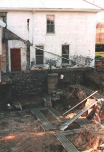
Excavations for the new basement. Love the drainspout on the old house; functional AND stylish. (Photo Credit: Gene Martin Design)

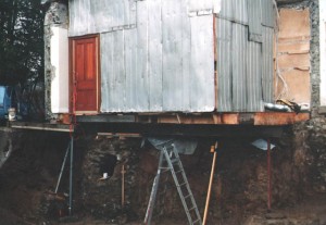
That meant a number of logistical challenges had to be addressed. The addition was being built with a new basement, which was excavated around the kitchen, leaving it floating in space above the new foundation. Until the addition was completed, it was wrapped in steel sheets that had previously been the roof of a lean-to garage, in an effort to keep the water out. And throughout the entire renovation, the tenants lived in the house, happily making breakfast mere feet from an open pit.

Watch that last step. It’s a doozy. (Photo Credit: Gene Martin Design)

Gene recently found some pictures from the time of the original excavation for the addition that illustrates exactly what they are dealing with. And impressively, the kitchen didn’t shift an inch through the entire process. It has good bones, this house. Really good bones.

To Ikea or Not to Ikea? That Really Is A Question

So we’re building a kitchen. A very big kitchen. A very big kitchen with lots of cabinets.

Having already built a house once, Dianne and I both know full well that one of the largest expenses in a kitchen is cabinetry. Our previous kitchen was built from custom cabinetry, and the price tag was impressive. So we already had some idea of what we were getting into as we considered taking on a brand new kitchen project, especially one that will now require as much cabinetry as is now being planned.

Many people swear by custom cabinetry, of course. Partly that’s practical: when you are dealing with a design that needs to fit within pre-existing walls, especially walls that are not necessarily completely square, fitting perfectly uniform boxes can be extremely awkward. Custom means that the cabinet will be tailored to fit regardless of the realities of the room. At the same time, some people insist on custom cabinets for the simple reason that they can.

Others will tell you that going the custom cabinetry route is a waste, and that you can get perfectly viable options much more cost effectively. What is considered one of the highest quality options, at a much more affordable price, is Ikea. Yes, that Ikea. The home of flat pack, Swedish meatballs and do-it-yourself hernias.

Ikea – Home of flat-pack, meatballs and do-it-yourself hernias (Photo Credit: North America Retail Architects Inc.)

While frequently snubbed as down-market, many renovators and designers have positive things to say about the quality of Ikea kitchen materials. Extremely positive things. One designer and renovator provides a detailed deconstruction of their kitchen materials, and why he has used them in more than 20 renovations to date. Another designer extols her love of Ikea kitchens, and explains why they are her preferred go to option.

The points they make are significant. The quality of their boxes are good, and often as good as you will get from a semi-custom kitchen manufacturer. Go to an Ikea showroom and open one of their cabinets, and you are faced with extremely solid 5/8″ thick MDF. Their hardware is also (mostly) excellent, and on par with custom installs, right down to soft-close drawers and doors. Their options in terms of drawer and door designs aren’t stellar, but are certainly competent. And if you do it right, and particularly if you install it yourself, you can get the same quality kitchen for as much as half the price. All of which are compelling arguments in favour of Ikea.

Ikea kitchens can indeed be funky, well designed and appealing spaces (Photo Credit: Carol Reed Designs)

So, to Ikea or not to Ikea? That is the question. For us, there are some drawbacks, and they are worth taking into consideration. For starters, the door styles tend towards the more modern. Based upon their catalogue, we thought they had a more traditional bead-board styling, which is what we are looking for, but it turns out to be a high gloss door with two inch strips of laminate positioned closely together to suggest bead-board. In the catalogue, it looked promising; in real life, sadly, it looks cheap. Their drawers have also changed since the two articles above; they are now exclusively plastic frames inside. I have no idea what their wear will be, but I’m enough of a snob to want real wood in my drawers, thank you very much.

We thought Ikea did bead-board. Less bead, more board, and not liking the final result (Photo Credit: Ikea)

The largest argument against, however, has to do with the size of the boxes. They are only sold in standard widths, meaning that if you are running the full length between two walls, there is a very good likelihood of leaving gaps at the end. More importantly, however, the height of all their cabinet boxes are standard, and designed to result in a uniform 36″ cabinet height once a counter is added. For my height, a counter of at least 39″ is a minimum; any shorter, and I can’t work for more than a half-an-hour in the kitchen without massive lower back pain. Meaning that our out-of-the-box Ikea kitchen would need about 35 linear feet of custom footings to raise the standard boxes to an appropriate height. The possible savings quickly start to disappear.

If you are trying to save money on your renovation, and in particular if you are going for a more modern look and feel to your kitchen, Ikea is certainly going to save you some money without sacrificing too much on quality. When it comes time to renovate the kitchen in the condo (and that day is certainly out there somewhere in the future) we full expect that Ikea will be our source of supply. For Boo Manor, however, we’re going the custom route. It will cost us more, certainly, but we get exactly the cabinets we need, at exactly the height we need them at. That is an investment that will quickly pay off.

Let The Renovations Commence!

We have finally taken possession of the house. Which means that the renovation plans can now proceed in earnest. And an hour after picking up the keys to the house, we were well into discussions on what to do and how to do it.

The plotting begins. Meeting at the house with Gene & Seren.

Since our initial meeting with Gene, he had been working on some conceptual options for how we could approach the renovation. In particular, a big question was what to do with the kitchen. Kitchens play a major role in any house. They are its centre, its gathering point, and the place every party migrates to. It is important, then, for the kitchen to be a place that you want to hang out in.

This creates a particular challenge in Boo Manor. The kitchen is truly the centre of the house – it is the dividing line, in fact, between the old house and the new house. Not just a place to wind up, it is in fact a thoroughfare, and one that is quite well travelled. On one side is the formal dining room, a gorgeous wood-panelled room in the original farmhouse. On the other side is the great room, the central living room with open windows, warm hearth and welcoming light. In between these two entertainment spaces, and central to both, is the kitchen.

The current kitchen has a number of problems. For starters, it is dark. It is an addition to the original house, but likely a very early one, and the walls are the same 18-inch-thick masonry featured in the rest of the farmhouse. Two narrow windows are the only source of light, and two doorways carve a path from old to new. The layout of the kitchen does what it can within this space; the cupboards and counter line one corner, and an island is an anchor in the middle of the room. Around the perimeter, however, is dead space. The previous owners had a table in the far corner, and a cabinet on one wall, but the result is a dark room that productively uses only a fraction of the space that is truly available.

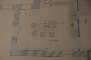
Faced with this challenge, Gene came up with some options. The first was simply a refresh of what was there now; the same layout, just more modern and with new appliances. The challenge is that it solves none of the current problems, it merely gives them a new veneer.

Thinking inside the box only gets you so far…

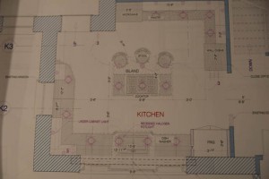
His second option, though, revisited the room from the outside in. To be functional, kitchens need a workable triangle between fridge, stove and sink. The sink is in many ways the anchor, and ideally is below a window, to give you something to look at while otherwise up to your arms in soapsuds. Given that the windows that exist are both narrow and in opposite corners of the kitchen, immediately adjacent to each doorway, they didn’t afford much in the way of an option. Gene’s solution? Let’s move the window.

And so began a design that envisioned a good 10 feet of window, lightening up the room considerably and providing a suitable anchor for the rest of the room. A counter could now line the outside wall, along with fridge, dishwasher and cupboard space. Across the room, more space for pantry, ovens, microwave and appliance storage. An island with cooktop becomes a central focal point for a completely revitalized kitchen that becomes somewhere you want to stop and spend time in, rather than something you want to pass through as quickly as possible on the way to somewhere else.

On the other hand, we could just completely rebuild the box…

The new design solves a number of problems with an otherwise difficult room. It becomes much lighter, makes far better use of space and provides considerably more storage. And all we need to do is carve a brand new window out of a hundred-year-old wall. That seems reasonable, doesn’t it?